


'Blanding over branding': Adland weighs in on Instagram’s new look
With creatives split over whether the refresh is smart evolution or another step towards a blander, more generic internet.

There’s something almost quaint (read: verging on insanity) about a social media platform attempting to quietly change its logo and expecting the internet not to have thoughts.
Instagram’s latest identity tweak has done exactly what any rebrand of a platform used by billions was destined to do: launch a thousand LinkedIn posts, and send the design world reaching for its red pens.
Alas, no real idea yet as to what it may mean for B2B sales.
Depending on who you ask, the new look is cleaner, sharper and better suited to Instagram’s next generation of users.
Or it’s another perfectly good piece of brand personality fed into the great digital blender, emerging smoother, safer and considerably less human.
So, rather than add another hot take to the pile, Mediaweek went to some of advertising’s sharpest creative and strategic minds to ask a simpler question: is Instagram’s new look actually any good?



The leading media trade publication in Australia.
Get our top stories straight to your inbox daily by signing up to our Newsletter
By providing your information, you agree to our Terms of Use and our Privacy Policy. We use vendors that may also process your information to help provide our services.
Adam Ferrier, Founder, Thinkerbell
A lot less human, a lot more robotic.
The cute, handwritten character of the old logo was becoming a valuable asset in an age of faceless AI and increasingly generic digital design.
Instagram should be leaning harder into what makes it feel human, not sanding it away.
It’ll be justified as more legible, cleaner and modern.
All very good reasons to not do this. I still don’t understand how decisions like this get made, supported and executed. Surely someone in that organisation could have stopped this. Again, a good example of blanding over branding.

Darren Song, Creative Director, Weave
For an app that has evolved from a Millennial mainstay into an algorithmically driven content machine that’s now clearly positioning itself as the digital home of Gen Z/Alpha, the rebrand feels spot on.
Visually, it captures that evolution.
A platform that’s changed and an audience that keeps changing requires an identity designed to move with both. Recognisably Instagram, but fresher, and with just enough quirky ownability to make you do a double-take.
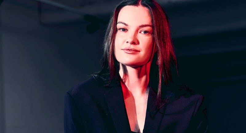
Rosie Brown, Head of Strategy, Kill Boring Dead
From a creative POV, the thing I am more interested in than the Z vs R debate is the brand pile-on that follows on socials.
My LinkedIn is full of AI commentary about Insta’s logo change, - brands are doing their own meme versions of it, a before-and-after with their logo in their brand colours, which, if you haven't already posted, is out of date.
The internet moves faster than most brand approval processes, and being third to a trend costs you more credibility than sitting it out entirely. But to be honest, in a few days, we will have all forgotten about it, and no one will remember what the logo looked like before or even the fact that it’s changed at all.

More from Mediaweek
The leading media trade publication in Australia.
Get our top stories straight to your inbox daily by signing up to our Newsletter
By providing your information, you agree to our Terms of Use and our Privacy Policy. We use vendors that may also process your information to help provide our services.

.jpg%3Fv%3D1790810309912&w=3840&q=75)
.jpg%3Fv%3D1790804252782&w=3840&q=75)

