QMS released its new brand look earlier this month. To learn more about the overhaul of the digital out of home makeover, Mediaweek spoke with Sara Lappage, QMS chief operating officer – customer, and Jaid Hulsbosch, Hulsbosch managing director.
“We have been wanting to rebrand for a while now,” said Lappage. “It has always been our goal to create a brand that not only reflected the vision but also captured the heart and soul of our business. With the enormous growth and constant change that has taken place since we launched in 2014, we are so very different today to the QMS from back then. We really could not have captured the essence of what our brand and business would become in the future, if we had tried to do this any sooner. After seven years of incredible growth and change, the time is definitely right for us now.”
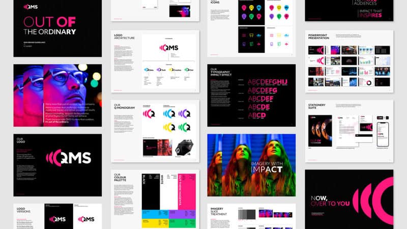
See also: QMS reveals new brand strategy, positioning, logo and visual identity
QMS: Shifting industry perception
“As we prepare to launch the reimagined City of Sydney network to the market, it is pivotal that we shift industry perception to better reflect our premium digital-first and data-led offering, presenting us with the perfect platform in which to revitalise our brand and reposition ourselves in market.”
Trusting your rebrand partner
To come up with the new look, QMS turned to a design firm known for its work with many iconic brands including Qantas, Apple, Woolworths and Seven West Media’s Channel 7 – Hulsbosch.
“Their proven track record in creating and shaping some of Australia’s most well-loved and recognised brands speaks for itself,” said Lappage. “Hans, Jaid and their incredible team really understood where we were at as a brand and business, and helped bring our people along for the journey from day one. They have an innate ability to unlock and articulate the thinking from deep within the heart of the business, and then harness it and create a clear strategy for the future.
“We felt very confident that Hulsbosch would help us create something that was simple, powerful and future-proofed to launch us into our next growth phase, and we couldn’t be happier with the result.”
Representing the impact of DOOH
When asked about the instructions from QMS, Jaid Hulsbosch told Mediaweek: “Put simply, the brief was to create a new brand that better represented the business and the people driving it forward. Sara, John and the brand team wanted something that came from everyone in the business that would stand out in the broader media industry. This brand we have created has been developed with the entire business and we think it showcases QMS’ personality as well as its direction and purpose as a true leader in DOOH.”
There are other elements in the rebrand beyond the three letters in the name.
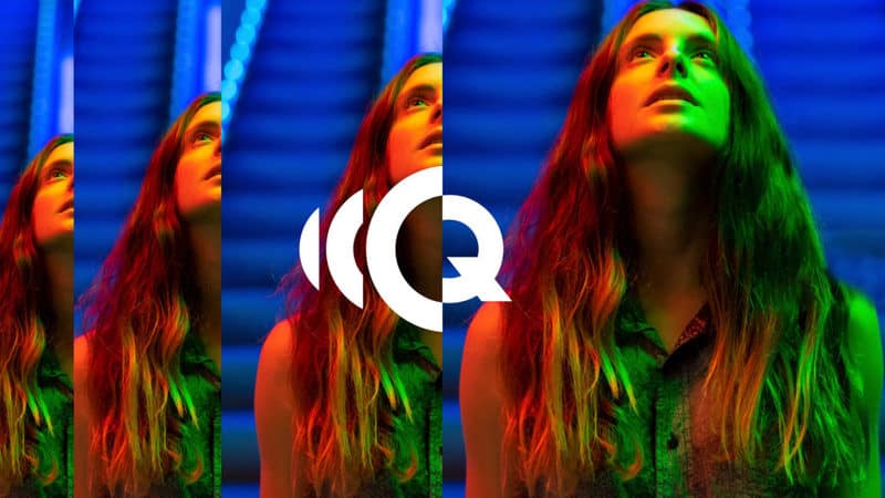
“The brand is all about the idea of unleashing the real impact of DOOH. This is the inspiration behind the ripple effect in the logo – but this idea also permeates throughout other key tools of the brand identity system; imagery is treated in ‘slice’ treatment which increases in impact and size from left to right; key words in headlines are treated with an ‘impact effect’ where the font weight increases from thin to black. Both these identity tools reinforce the visual idea in the logo, and together with a bold and electric colour palette, drum home a constant visual message of maximising impact.
“Having a distinctive verbal identity was also key to developing a compelling brand. Starting with the new tagline ‘Out of the Ordinary’, the new brand voice of QMS is all about messages that capture the innovation and inspiration that DOOH offers, but in a style that is short, punchy while still being grounded.
“Another critical part of reinventing the QMS brand was to unite a dispirit set of sub brands and service offers under a monolithic structure, ensuring brand equity flowed back to the masterbrand. We developed a nomenclature system with four key pillar offerings Q-Data, Q-Tech, Q-Creative and Q-Print. Using the Q as a constant, allowed us to use the icon from the QMS logo – creating a powerful visual link between the masterbrand and its product and services.”
QMS: Identifying the brand
An important part of any branding for an out of home company is to have a logo that can be read from a distance on their assets whether it be street furniture people walk past or the side of buildings or highway billboards with passing traffic.
“Legibility is the foundation for any logo design, and being an outdoor media brand, the logo needs to work extra hard and from a variety of distances,” agreed Hulsbosch.
“Our solution compacts the logo by building the icon inside the logo mark – increasing the type size and enhancing legibility. This combined with clean typography and contrast colours on a black background makes the logo really punch out and be quick and easy to read.
“The logo’s simplicity is also the key to making it memorable. But just as important, is that an ‘efficient’ logo doesn’t detract the audiences from the actual message and brands on the billboards – the clients that QMS are supporting.”
QMS: Be bold yet simple
“The bold, simple approach to the logo has been applied across all key touch points,” added Lappage. “It is reflected in our sub-brands, our tone of voice, our thinking and our approach to market. Bringing new ways of understanding and using digital out of home for our clients and partners, but in a more simplified way to deliver the results they are after.”
Changing the brand tags across the QMS network is a significant task, said Lappage.
“As you can appreciate, given the volume of inventory across our digital and static billboards, street furniture and 7-Eleven Impulse network, there is a fair bit to change over across the country, and therefore that will be a phased approach over the next 3-6 months.”
City of Sydney launch approaching
The most anticipated reveal for the new branding will be when the new City of Sydney network launches. “The network is progressing well, and we are on schedule with the rollout of the first tranche of new street furniture assets from late November. We will soon be revealing the world-class designs to the market and the excitement is building as this key milestone approaches.
“From a market perspective, partnership discussions are in full swing. Following the initial expressions of interest period, we launched our exclusive partnership opportunities to key partners, agencies and brands this week and feedback has been overwhelming. Now we are looking to lock in these category exclusive launch partners over the next few weeks as we prepare to unveil our City of Sydney offering to the wider market next month.”
See also: QMS Media preparing to unveil launch partner packages for City of Sydney