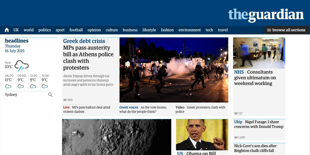
Following the relaunch of theguardian.com late last year, the site has undergone some more recent changes. Designed to enhance the user experience and make The Guardian‘s journalism more discoverable, the changes include a sticky navigation bar for the entire site which speeds up the process of moving around the site.
A post on The Guardian‘s blog explains: “After several months of trials, surveys and testing on the site and in our user experience lab we’ve got a first release of this feature that today we are opening up to our whole readership. Having released it to a proportion of our audience already, we know that readers navigate more quickly around the site. The navigation elements of a site are by no means a static thing – over time, readers needs and preferences change and so must we.” It also hints that an increasingly personalised user experience will soon be rolled out.
The changed design also has impact for The Guardian‘s advertisers. Ad placement is now optimised, while just-in-time ads and inserted ads are also being introduced.
Comments on the blog suggest that the reaction is mixed, with one commenter calling the sticky navigation bar “that annoying blue thing at the top of the screen that I can’t get rid of”, while others suggest it “looks useful”.