The Women’s National Basketball League (WNBL) has unveiled a revamped brand identity under the banner ‘Ready to Rise’, marking a significant evolution for Australia’s premier women’s basketball competition.
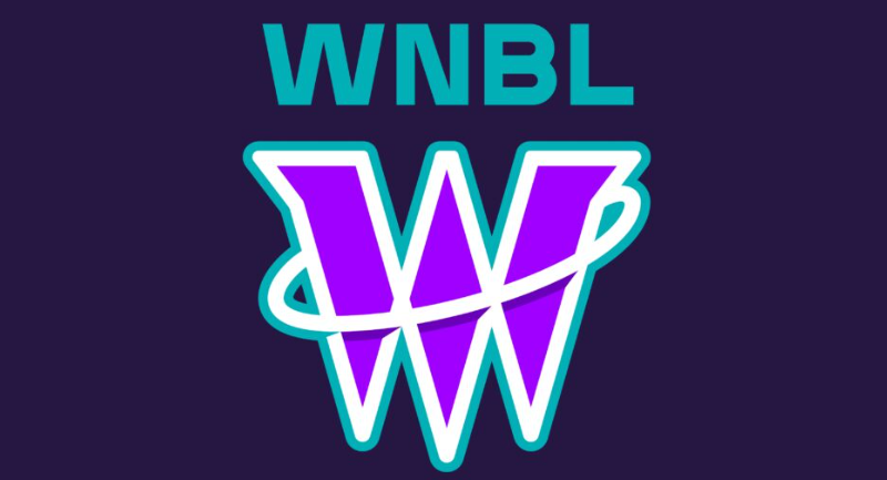
This strategic rebrand, developed with input from current and former players as well as club stakeholders, introduces a dynamic new logo featuring a stylised ‘w’ motif that echoes the shape of a basketball net and hoop, transforming into a wing-like symbol. According to the league, this new design reflects the agility, power and upward trajectory of women’s basketball in Australia.

The WNBL logo
Jennie Sager, Chief Executive Officer of the WNBL, said the rebrand represents a foundational shift as the league positions itself for future growth. “The WNBL as we know it has been forged from a rich history, and today we enter a brand-new chapter of the league, one that is shaping the future of the game for our players, fans and clubs,” she said.
Sager noted that the rebrand is one of several reforms introduced since the WNBL assumed operational control in April, including a landmark Collective Bargaining Agreement that introduced pro-rata pay parity.
Olympian and WNBA player Jade Melbourne welcomed the new brand, saying it embodies the league’s momentum. “It’s ours, it’s our new league, it’s a great product and it’s only going to get better and better with a fresh start and new logo,” she said.
The brand overhaul aims to enhance the league’s professional image and broaden its appeal as it continues to grow its audience and commercial footprint.
