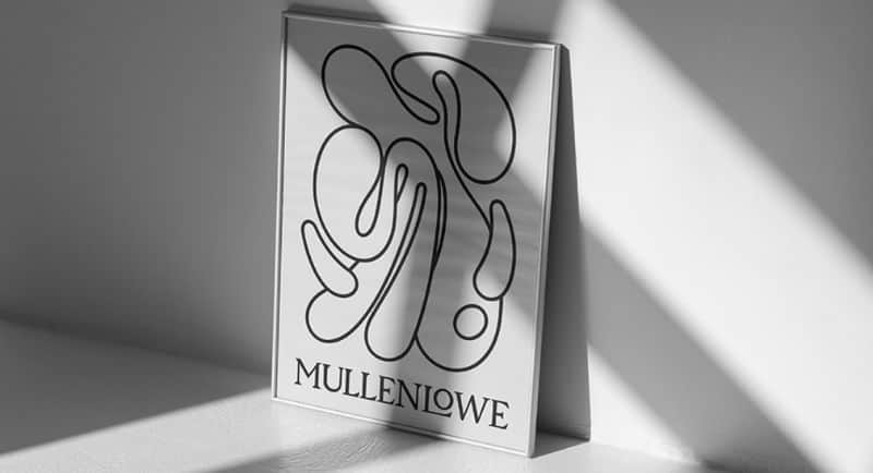
MullenLowe has unveiled its new global identity and refreshed positioning that unites the networks across 57 markets.
The agency is marking a new era as it evolves from the octopus mascot to a kindred spirit that visually represents how brands need to grow.
Kristen Cavallo, CEO of MullenLowe Global, said the mascot offers the perfect metaphor.
“The octopus has survived over 300 million years precisely because of its fluidity and ability to adapt. It is the only organism that routinely self-edits its own DNA—a model for how brands should behave today.”
The refreshed and reinvented logo was created MullenLowe U.S. and led by head of design João Paz. He said: “We want to challenge the way brands show up in the world. Our octopus is not afraid of change; it’s in its nature, its DNA. We embraced that with a fully generative identity, crafted to show personalisation at scale.”
“Our octopus is alive. It has a will, a personality, and, above all, it wants to move. With its endless twists and turns, it has the freedom to reinvent itself infinitely,” Paz added.
The new branding also includes a refresh to agency’s communications, including the website and social media.
Cavallo said: “This is more than just a logo redesign. We have a point of view on how brands grow, and we built our identity and voice to reflect that belief.
“In a rapidly changing world, more of the same is not the path to long-term success. Brands need to earn and continually defend their unfair share of attention. Products might be boring, but brands can never afford to be,” she added.
See also: 303 MullenLowe Perth welcomes Matt Oakley as chief strategy officer
