
What started as a small family-owned shoe store in 1892, called Betts & Betts has grown into one of Australia’s most enduring and iconic footwear brands.
While the name may have lost a ‘Betts’ along the way, the brand’s values of craftsmanship, care, and creativity remain firmly intact.
Today, that legacy continues under the leadership of fifth-generation family member Michael Breckler, who serves as Chief Executive Officer and Director at Betts.
In its earlier years, Betts offered a wide range of shoes for men, women, and children under multiple sub-brands.
Over time, the company refined its focus to women’s footwear, a move that set the stage for its transformation into a more fashion-forward, premium brand.
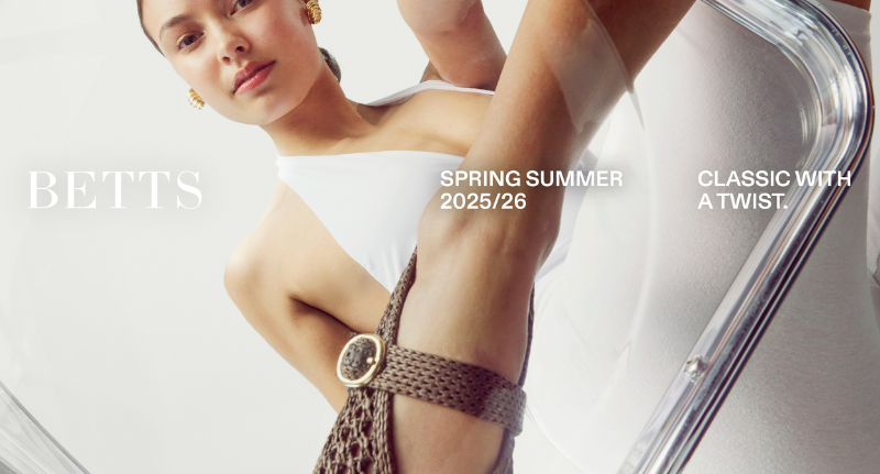
Now, Betts is entering a new era, one that honours its heritage while stepping confidently into the modern fashion landscape through the creative lens of Melbourne-based agency Willow & Blake.
Classic with a twist
“I always thought of them as a school-shoe brand, maybe a little dated. So when I found out we’d get to rebrand it, I was genuinely excited,” said Bri Nixon, Creative Director at Willow & Blake
told Mediaweek.
Taking inspiration from other brand transformations, Nixon wanted to elevate the brand in a fun and relatable way and create “something that feels premium but still accessible.”
The refreshed visual design features a modern Bodoni wordmark, a signature oxblood colour palette, and a custom ‘B’ icon, a flower-like symbol inspired by the Breckler family gathered around a table, representing both unity and legacy.
True to roots
Willow & Blake’s design team approached the rebrand as a fusion of tradition and modernity. The new brand language channels the refinement of luxury fashion houses while staying rooted in accessibility for a mainstream audience.
“We wanted to create a visual language that feels premium but still has personality,” said Nixon.
“Every element from the typography to the tone of voice has one foot in high fashion and one foot in fun.”
Designer Lead Noah added that the new insignia symbolises the family’s long-standing presence in Australian retail. “The ‘B’ icon evolved into something that felt meaningful. Through iterations, it began to resemble a gathering a metaphor for the Breckler family and their connection to the brand.”
The partnership between Betts and Willow & Blake was collaborative from the outset. “Mike and the team were open to creativity and bold ideas from day one,” Nixon said.
“They weren’t afraid to take risks if the strategy made sense. That kind of collaboration made all the difference.”
For Betts CEO Michael Breckler, the rebrand is both a tribute to the past and a declaration of intent for the future.
“For a family business to endure this long, change and evolution is essential,” Breckler said.
“This rebrand honours our legacy while redefining who we are today – a brand for women who value style, quality, and confidence.”
Walking into the future… again
The refreshed identity extends beyond visual design, influencing Betts’ storytelling, tone of voice, and digital presence. The new website and social strategy reflect a confident, modern woman charmingly offbeat yet effortlessly refined.
As Betts looks ahead, the brand’s evolution underlines a familiar truth: staying relevant doesn’t mean letting go of the past, it means reimagining it. And after 133 years, Betts is once again stepping forward in style.

The ‘new’ Betts